

Quick answer
If your website gets traffic but no enquiries, the cause is usually one of three things. You’re attracting the wrong people, visitors don’t see a good enough reason to choose you, or something on the site stops them understanding, trusting or contacting you. Check them in that order, and check your enquiry tracking works, before you spend more on ads or commission a redesign.
I once worked with a recruitment business whose marketing manager was convinced the website was only working for one of their two audiences, solicitors and accountants. He believed the two groups needed different experiences and different content, which sounded perfectly reasonable.
So we sat down one to one with solicitors and accountants, interviewed them and watched them use our client’s website and their competitors’ sites. What we found surprised everyone. Both groups behaved in almost exactly the same way, their needs and wants were pretty much identical, and the real problem with the site was something nobody in the business had expected.
I’ll come back to what that was, because it’s the reason this guide exists. If your website is getting traffic but no enquiries, the problem you think you have often isn’t the one your visitors are having, and the fix depends entirely on which one it is.
Why isn’t my website generating enquiries?
Here’s what each of those three areas means in practice.
The traffic. Are the people arriving on your site the ones who need what you do?
The offer. Do they understand what you do, and can they see a reason to pick you over the alternatives they’ve almost certainly got open in another tab?
The website experience. Can they find what they need, feel confident about you and take the next step without a fight?
And before any of that, spend ten minutes checking your enquiries are being recorded properly. I’ve seen broken forms and misconfigured analytics make a perfectly decent website look like a disaster, which is an expensive thing to discover after a redesign.
Here’s a rough guide to where the problem might sit, based on what you’re seeing.
| What you’re seeing | What might be wrong | Where to start |
|---|---|---|
| Lots of visitors, few seem relevant | Traffic quality | Step 1 |
| Visitors arrive but don’t explore | Unclear message or mismatched landing page | Step 2 |
| People explore but don’t enquire | Weak offer or confusing journey | Step 3 |
| Visitors struggle to find information and leave | Poor navigation or usability | Step 4 |
| People look but hold back | Not enough trust, or no clear reason to choose you | Step 5 |
| People start forms but don’t finish | Form errors or off-putting questions | Step 6 |
| Enquiries happen but don’t show up in analytics | Tracking issues | Check before anything else |
These are clues rather than diagnoses, and the areas overlap, so treat the table as a place to start looking.
What the recruitment research found
Back to the recruitment site. Solicitors and accountants both wanted the same thing, which was to find relevant jobs quickly, and the site made that much harder work than it should have been. The job search was difficult to find, the results weren’t always relevant and people struggled to narrow them down by location or anything else that mattered to them.
But the bigger finding was that every participant told us they wouldn’t come back to the site over the alternatives they’d used, and the reason wasn’t the design or the navigation at all. The other sites simply had far more jobs on them.
That changed the whole conversation. Yes, the website needed UX improvements, but making the search easier wasn’t going to persuade anyone to return if there wasn’t much there to find. The business also had to think about why anyone would choose its service in the first place.
The problem the business thought it had wasn’t the problem its customers were having.
I’ve seen versions of this throughout my career. A client comes to me with a specific thing they want fixed, or a clear idea of what’s wrong, and once I review the site or watch real people use it, something different shows up. It’s why I always want to understand the problem before anyone starts on the solution, because otherwise you end up working from assumptions rather than insights.
Step 1: Are you attracting the right people?
You might have thousands of visitors a month, but the question that matters is how many of them could ever become customers.
If you’re running Google Ads, start with the search terms report and look at what people actually typed before they clicked. Are they searching for something you offer? Then look at where they landed. Say someone searches for business insurance for a small firm, your ad looks promising, and they land on a page that’s mostly about cover for large organisations. They might have been a perfect customer, but the page told them otherwise and they left.
It’s also worth separating people who are researching from people who are ready to buy. Both are valuable, but they need different things from you, and I’ll come back to that in step 6.
What to check
- Are visitors searching for something you actually offer?
- Does the landing page deliver what the ad promised?
- Are you reaching likely customers, or people who are never going to be a fit?
What to do next: If the traffic is wrong, fix your targeting, ads and landing pages before you touch the rest of the website. If the traffic looks right, the problem is what happens when people arrive.
Step 2: Can people tell what you do within a few seconds?
I’ve spent around 25 years watching people research, compare and buy things online, everything from holidays and cars to software and professional services. One thing that never changes is how quickly people decide whether a site is worth their time.
When someone lands on your page, they’re trying to answer a few simple questions. Am I in the right place? Can these people help me? Do they look like a business I can trust? They aren’t reading every word to get there. They’re scanning your headline, imagery and navigation for clues, and if they’re not sure, going back to Google and clicking the next result costs them nothing.
The hard part is that you can’t judge this yourself. You know what your services mean, who they’re for and why someone should choose you, so your page makes perfect sense to you. Your visitors arrive without any of that knowledge, usually having looked at a few of your competitors first, and what feels obvious from the inside often isn’t obvious at all from the outside.
Try this
Open your homepage or your busiest landing page and, without scrolling, ask whether it’s obvious what you do, who you help and why someone should choose you. Then show it to someone who doesn’t know your business, explain nothing, and ask them what they think you offer and who it’s for. You want an answer within 10 to 20 seconds, and if they have to think hard about it, you’ve got a problem. The gap between what you think the page says and what they tell you is usually where that problem lives.
Do this on a phone as well as a laptop, because what fits above the fold on your desktop screen is often a logo, a stock photo and half a headline on mobile.
You can also try a squint test. Half close your eyes, look at the page and notice what jumps out most. Is it the thing you want people to notice? If lots of things are competing for attention, that’s a problem too, because anything that makes people work hard to understand you is likely to lose out to the next result on Google.
Pro tip
If you want to be more thorough, try a five-second test. These tools show your page to real people for five seconds and then ask what they remember, which gives you a more objective view of whether the design is communicating what you want it to. A few you can try are Useberry, Maze and Lyssna. None of them are paying me to say that.
What good looks like
One of my favourite examples of a really clear value proposition is Grammarly’s homepage. It’s nothing to do with what most of my clients sell, but it’s a useful benchmark.
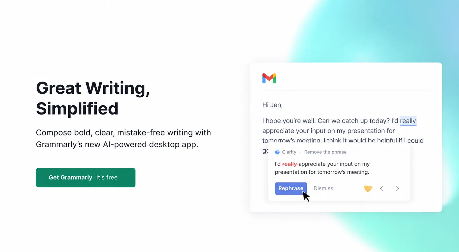
The headline says “Great Writing, Simplified”, which tells you the outcome you’ll get and how it’ll feel to get it, in plain words with no jargon and none of the “we are the leading provider of” stuff. The line underneath, “Compose bold, clear, mistake-free writing”, then makes that promise concrete, and that’s what earns your trust.
What’s not there matters just as much. There’s nothing about who built it, how long they’ve been going or what their mission is. It’s all about the person reading it and what they get out of it.
Most websites I review really struggle with this. They take an internal view of the business and project it outwards, leading with what the company does rather than what the visitor gets, and that’s exactly where they lose people.
What to do next: If people can’t work out what you offer, fix the headline, supporting copy and imagery first. There’s no point polishing the design of a page whose message isn’t landing.
Want a second opinion? Send me your website and I’ll record a free video walkthrough of what I see.
Step 3: Is your offer worth choosing?
Sometimes people understand exactly what you offer and still don’t see a reason to pick you. That’s a different problem from UX, and it’s exactly what the recruitment research showed.
Sometimes it’s a framing problem. Your key benefits might be buried, or explained in language that makes sense to you but not to your customers. Sometimes your competitors genuinely have the edge, with deeper specialist expertise, better availability or more flexible terms. And sometimes your offer is good, but the website hides the reasons why under things that matter more to you than to your customers. Businesses tend to talk about what they’re proud of, and that isn’t always what the customer is weighing up.
I worked with a software company that was adamant its value was a friendly, approachable team of UK-based developers who could build any software for anyone. When I spoke to their clients, the thing they valued most was something else entirely. They felt the team really understood business, cared about their business problems and could translate those problems into software that solved them. That was a far more compelling message, and it stood out from their competitors in a way “friendly UK developers” never would.
Try this
Imagine a potential customer comparing you with two competitors side by side. Write down the reasons they should choose you, then look at your website and see how many of those reasons are actually visible, backed up with evidence, and about something the customer cares about.
What to do next: If your offer doesn’t stand out, find out what customers value before you rewrite anything. Five or six short customer conversations will usually tell you more than another round of internal messaging workshops. Pick up the phone, call a few customers and ask why they chose you, what difference you make to them and how they’d describe what you do to a colleague.
I think this is one of the areas where you’ll struggle most to see it yourself. It helps to have someone outside the business to work through ideas with you, look at things through your customers’ eyes and, ideally, speak to those customers directly. It’s a big part of the work I do with clients.
Step 4: Can visitors find what they’re looking for?
Say someone understands your offer and decides you’re worth a look. In my experience people are often happy to spend a fair amount of time on a site, as long as they feel they’re getting somewhere. The trouble starts when that sense of progress disappears, because the navigation uses words they don’t recognise, the page is so cluttered they can’t tell where to look, or a link takes them somewhere they didn’t expect.
People don’t mind spending time on a website. They mind wasting time on one.
This is why I don’t put much weight on the old three-click rule, the idea that everything should be reachable within three clicks. What matters is whether each click makes sense and moves people closer to what they came for.
It’s a bit like a supermarket. Sometimes the thing you need is right in the far corner of a big store, but if you know where it is and you’re confident they’ll have it, you’ll happily make the walk. If you arrive at the door with no idea where it is, or whether they even stock it, you might not bother.
It also helps to know that most people scan before they read. They skim headings, links and images looking for signs they’re heading in the right direction, and only settle down to read properly when they find something relevant. A lot of pages are written as though visitors will start at the top and read every word, and most of them won’t.
Try this
Pick something a potential customer would want to know, such as whether you offer a particular service or have worked with businesses like theirs. Start on your homepage and try to find it, asking at each step whether it’s obvious where to go next and whether the next page delivers what you expected. Better still, watch someone who doesn’t know your business try it, and don’t help them, however much you want to.
What to do next: Look for confusing labels, vague headings, clutter and missing information, and focus on making the route easy to follow rather than shorter.
Not sure where people are getting lost? Send me your website and I’ll record a free video walkthrough.
Step 5: Why don’t visitors trust my website enough to enquire?
Finding the right service doesn’t mean someone’s ready to get in touch. They still need to feel confident about you, and that matters more the bigger, more expensive or longer-term the commitment is.
Think about what they want to know first. Have you worked with businesses like theirs? Can you prove you know what you’re doing? What’s it actually like to work with you, and what happens after they press send? Quite often it’s what’s missing that does the damage, like a beautifully designed services page with no examples of the work, or plenty of confident claims and nothing to back them up.
Social proof matters a lot here. Reviews, testimonials, case studies and evidence that you’ve actually done what you say you do all build confidence. People often don’t read them in full, but just seeing them there, with a name and a photo of what looks like a real person, can make a big difference.
So do trust signals like certifications, a phone number, a named person to speak to, real faces and a physical address. You’d be surprised how much it matters to people to know there’s a real business behind the website, with real people they can talk to if they need to.
Small things chip away at confidence too. Poor-quality images, inconsistent layouts, cluttered pages, slow loading and clunky wording all make a business feel a little less credible, and visitors usually can’t tell you exactly what’s wrong. They just don’t feel comfortable taking the next step.
It’s also worth remembering your customers spend far more time on other people’s websites than on yours. Their expectations are shaped by everything else they use online, so when your site feels harder to use or less professional than what they’re used to, that creates doubt. That doesn’t mean every website should look the same, but if you’re going to do something differently, there should be a good reason for it.
Which would you buy from?
Take a look at these two websites. Imagine they’re the only two places that still have what you want in stock. Which one would you buy from, Geekys or Fonestore?
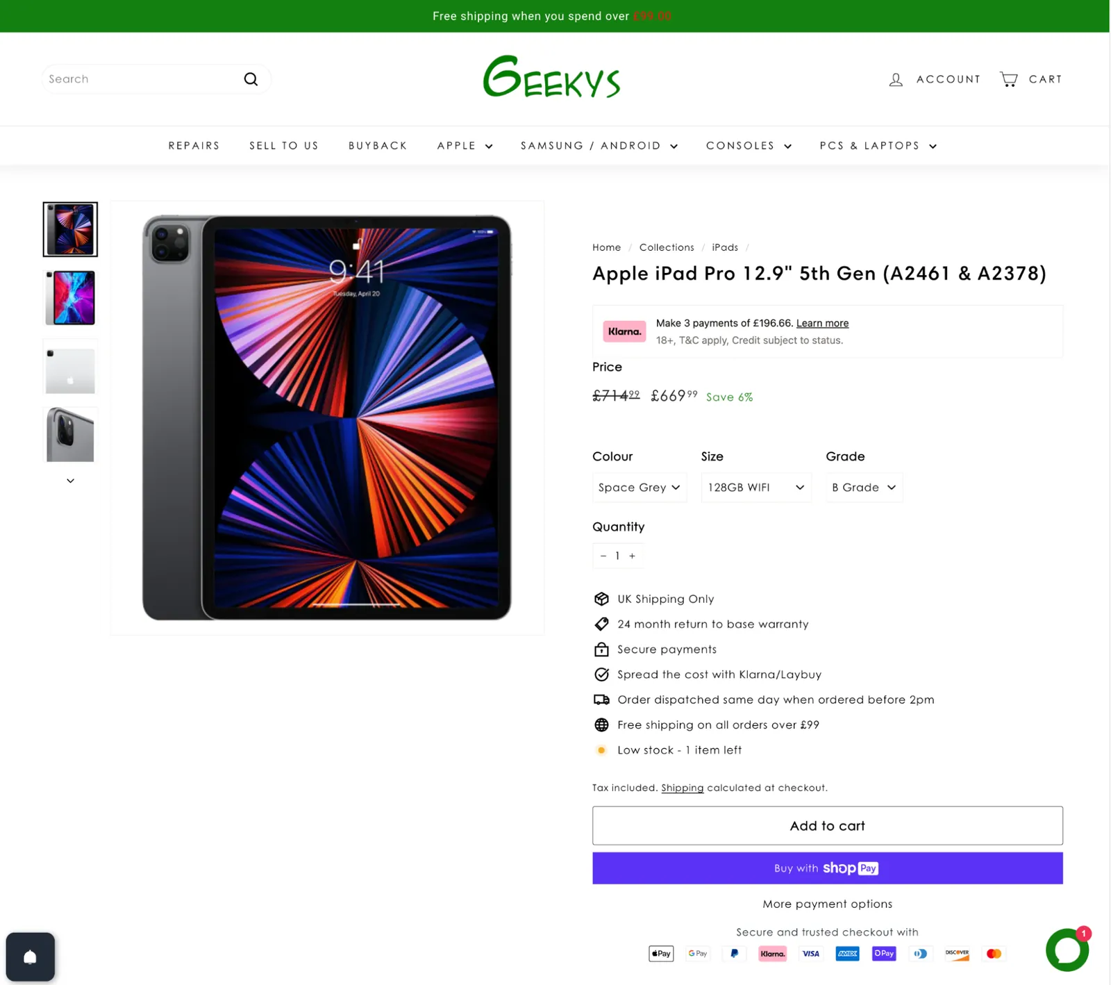
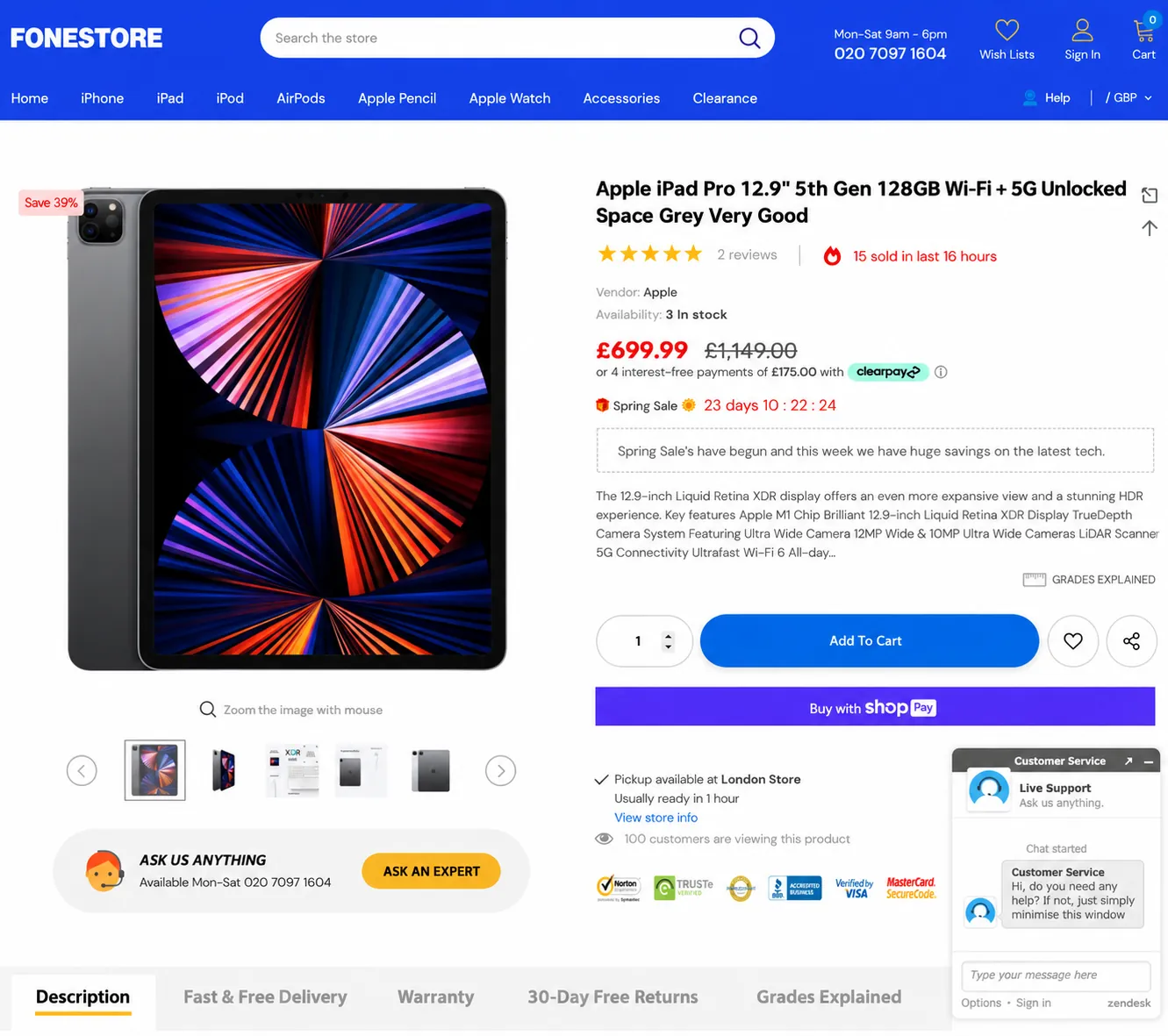
My guess is you’d be tempted by the lower price at Geekys, but Fonestore gives you far more reasons to trust it. There’s a phone number in the navigation, reviews, a note that 15 sold in the last 16 hours, an “ask us anything” prompt, live support, the option to pick up from a physical store and 30-day free returns. Each one is small on its own, but together they can be enough to tip the decision.
Try this
Put your site next to two or three alternatives and compare how each one shows its experience, explains what it does and makes getting in touch feel safe. Look beyond direct competitors too, at sites that make a complicated decision feel simple, and note what you could borrow.
What to do next: Back up your claims with real evidence, tidy up the content that undermines you, and make sure the design builds confidence rather than doubt.
Step 6: Is the next step right for where the visitor is?
Even someone who understands your offer and trusts you might not be ready to enquire, because the only next step on offer feels like too big a commitment. Someone still exploring their options might happily look at your work, read about your process or get a rough idea of cost, but they’re not ready to book a sales call. Meanwhile, someone who’s already decided shouldn’t have to hunt around for a contact button.
Someone who’s researching needs help understanding their options. Someone who’s ready to buy needs an easy way to take the next step.
I worked with a SaaS company that was getting plenty of traffic but very few enquiries. When I sat with their ideal customers as they browsed the site and a few competitors, it became clear they were wary of booking a demo, which was the only call to action on offer. To them, a demo meant a sales call. They pictured being stuck on the phone with a salesperson for an hour and then being chased for weeks afterwards. They were willing to do that for the right platform, but the site didn’t give them enough confidence the tool was right for them to justify that kind of time, especially when they’d probably be looking at two or three alternatives too.
So we brought more of the software itself into the website, so people could see what it did and get comfortable with it before committing to anything. That built trust and made the whole thing feel more transparent. We also made it clear what the demo involved, and that it wasn’t a sales call in disguise.
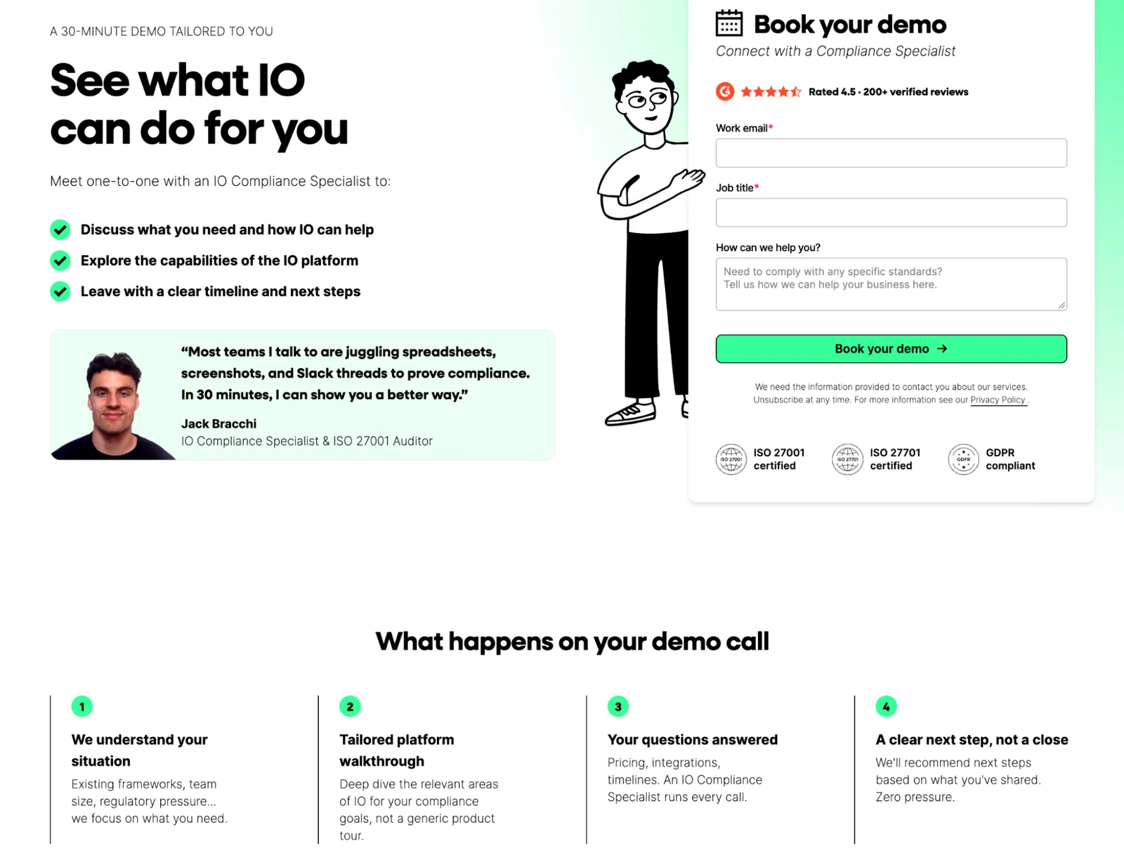
Your website needs to serve both kinds of visitor, and then the basics need to work. Forms should work and ask only for what you need, contact details should be easy to find, everything should work properly on a phone, and people should know what happens after they get in touch.
Try this
On your phone, find a service you’d be interested in and try to enquire. Is the next step obvious? Does the form ask for more than seems reasonable? Do you get a clear confirmation? Then check that the enquiry shows up in your analytics and reaches the right person’s inbox.
What to do next: Remove anything that makes enquiring harder than it needs to be, and offer a lighter next step for people who aren’t ready to talk yet.
How do I know which problem to fix first?
By now you’ll probably have a few suspects. The catch is that spotting a possible problem isn’t the same as knowing it’s the one costing you enquiries.
Your analytics might show people leaving a particular page, which tells you what’s happening but not why. They might not have found what they needed, the offer might not have been right for them, or they might have got exactly what they came for and just weren’t ready to buy. You can’t tell those apart from the numbers alone, which is where watching real people use the site earns its keep. It shows you the problems analytics can’t, and it stops you spending money fixing things that were never the problem.
When it comes to deciding what to do first, I ask three questions.
How many people does it affect? A confusing headline on your main landing page touches far more visitors than a niggle buried five pages deep.
What could it be costing you? Anything that stops people understanding your offer or finishing an enquiry beats a minor visual inconsistency.
How sure are you it’s a real problem? Something that looks wrong to an experienced reviewer is a hypothesis. Something you’ve watched several customers struggle with is evidence.
You don’t have to fix everything at once. Start with whatever scores highest on all three.
Should I redesign my website if it’s not generating leads?
Not necessarily, and probably not first. Some of the biggest improvements I’ve seen came from a clearer offer, a handful of rewritten pages or making key information easier to find, none of which needed a redesign. Sometimes the problems do run deeper and a redesign is the right call, but if you redesign without knowing why people aren’t enquiring, you risk ending up with a nicer-looking version of the same problem. A redesign on its own can be a plaster on a wound that needs stitches.
When I review a website, I’m drawing on years of watching people research and buy online to spot where visitors are likely to struggle, and looking at competitors and well-designed sites elsewhere for examples of what could work better. That gets you a long way. Where the stakes are higher or the answer isn’t obvious, a small amount of research with real customers tells you what’s actually going on, and that’s a far better place to start than guessing.
Not sure what’s stopping people from enquiring?
If you’d like a second pair of eyes, send me your website and I’ll record a free video walkthrough showing where I think visitors are getting stuck and what I’d look at first. You can make the changes with us, with your existing agency or on your own, it genuinely doesn’t matter to me which. Give me a shout.